The Peaceful Artworks Journal · Decorating with art
A tangle of white flowers against an old fence. Roses spilling across a path. A book left open in the shade. The best garden paintings give you somewhere to look, and somewhere to imagine being.
That is a good place to start when choosing art for a cottagecore home. A room with old wood, linen and a few collected pieces already has plenty of texture. What a painting can add is a view: a patch of green above a chest of drawers, or a suggestion of summer beside a chair you use all winter.
We have chosen five prints from our shop that approach the garden quite differently. Look closely at the paintings below. Each offers its own starting point for a room, from deep woodland greens to the yellow of a sunlit parasol.
THE UNTIDY GARDEN
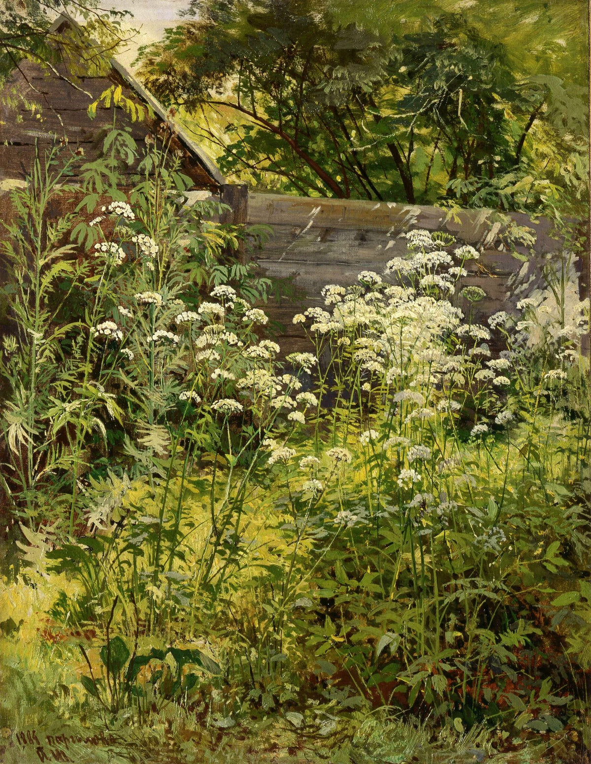
Goutweed Grass
Ivan Shishkin, 1884
Fine art print from the Peaceful Artworks collection.
The fence has seen better days, and the plants have made themselves thoroughly at home. White flower heads rise through a mass of green; behind them, weathered boards and a sloping roof almost disappear into the leaves. Shishkin gives this overlooked corner the attention another painter might give a grand view.
It is an especially good choice if you like the less polished side of cottagecore: worn floorboards, stoneware jugs, a wooden stool with a purpose. There is enough detail to reward a closer look, but from across the room the painting reads as a rich, restful patch of foliage.
Where we would hang it: above a small oak chest in a hallway, or beside a reading chair. A simple brown wooden frame would pick up the fence and shed without competing with the flowers. On a cream wall, the darker greens would have room to stand out.
For a colour connection, try an olive cushion or a dark green lampshade. One repeated shade is enough; the rest of the room can carry on being itself.
ROSES AND SUMMER LIGHT
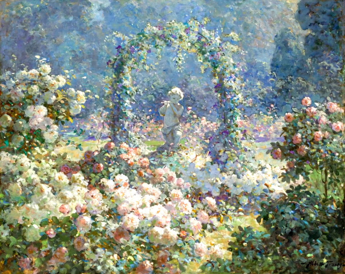
Hunnewell Gardens
Abbott Fuller Graves
Fine art print from the Peaceful Artworks collection.
Here the garden is all bloom. Pale roses crowd the foreground, an arch leads the eye towards a small statue, and blue-green shade gives the flowers something to shine against. The little shifts between pink, cream and green are much of the pleasure of looking at it.
Of these prints, this is the one we would choose for a room with floral curtains or a faded patterned rug. It has the fullness those rooms can carry, with cooler colour in the background to balance the roses. It would also bring welcome detail to a very plain bedroom.
Where we would hang it: over a painted dresser, with a lamp at one end and a little clear space beneath the frame. Warm white, pale pink and muted blue would all sit comfortably nearby. If the room already has a strong floral pattern, choose a plain mount and keep the objects around the print fairly simple.
A modest gold-toned frame would suit its romantic character. Natural wood would make the same picture feel a little more informal. Both can work; let your furniture decide.
AN AFTERNOON IN THE SHADE
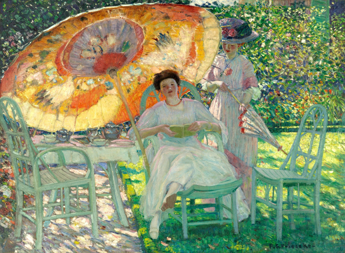
The Garden Parasol
Frederick Carl Frieseke, 1910
Fine art print from the Peaceful Artworks collection.
The yellow parasol catches your eye first. Then come the green chairs, the pale dresses and the scattered light beneath the table. There are people here, and furniture, and the familiar business of finding a comfortable place to sit outside.
Frieseke’s painting brings a different energy to a cottagecore room. Its colour is bolder than Shishkin’s, and its garden feels lived in. If your space is mostly neutral and needs a little life, this would be our pick.
Where we would hang it: in a breakfast room or above a sitting-room sideboard. Try it near a woven chair, pale walls and a small amount of buttery yellow. You could borrow the green of the garden furniture for a cushion; you do not need to repeat the entire palette.
Leave a generous stretch of wall around it. The parasol already supplies a strong pattern, so the painting can do the decorative work while the surrounding pieces stay straightforward.
FLOWERS FOR THE TABLE
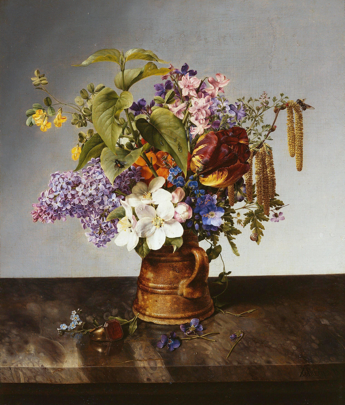
Bouquet of Garden Flowers
Johann Wilhelm Preyer, 1831
Fine art print from the Peaceful Artworks collection.
A brown jug, a generous handful of flowers and a grey background: Preyer gives you plenty to look at without needing a garden path or a distant view. Lilac clusters sit beside pale blossoms, while a dark, striped tulip brings weight to the middle of the arrangement. The stems reach out at different angles, so the bouquet keeps its freshly gathered character.
A floral still life is useful in a small room. It brings the garden close enough to study, and its upright shape fits neatly into the narrow spaces beside a dresser or doorway. The pottery also makes a lovely connection with the everyday objects of a cottage kitchen.
Where we would hang it: above a dining-room side table or near a shelf of stoneware, away from cooking steam and splashes. Try a walnut-coloured frame and an off-white mount. The lilac and blue flowers offer a gentle way to introduce cooler colour among honey-toned wood and cream walls.
If you already keep fresh flowers on the table, let them change with the season. The print supplies a constant arrangement without asking the real bouquet to match.
A BOOK BESIDE THE PORCH
Sisters in a Garden
H. A. Brendekilde, 1909
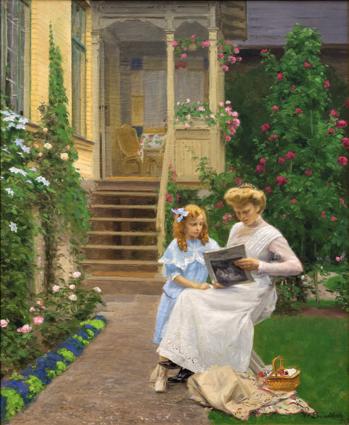
Fine art print from the Peaceful Artworks collection.
The eye wanders up the wooden steps to the sheltered porch, then comes back to the two figures sharing a book. Roses climb beside the house; pale flowers soften the opposite edge. There is a pleasing sense that the garden begins at the doorstep and carries on around the people who live there.
This print brings a human story to a collection of flower and foliage paintings. The book gives it an obvious home near a reading chair, but the yellow house and green planting are just as useful when choosing colours for the surrounding room.
Where we would hang it: in a snug, beside a bookcase or above a small writing desk. Pale blue fabric would pick up the younger figure’s dress, while warm wood would echo the steps. A simple frame suits the domestic subject and leaves the climbing flowers free to provide the decoration.
For a pair, place it near Goutweed Grass. Both include weathered timber and abundant planting, but the shared book gives this scene a different point of interest. Keep the mount colour consistent if you want them to feel connected.
Choosing between them
For depth and earthy colour: choose Goutweed Grass. It works particularly well with brown wood and unbleached fabrics.
For flowers and a softer palette: choose Hunnewell Gardens. Think painted furniture, pale walls and a little faded pink.
For warmth and brighter colour: choose The Garden Parasol. Its yellow and green are useful starting points for a cheerful sitting or dining space.
For a dining nook: Bouquet of Garden Flowers brings a compact floral arrangement and pottery tones. For a reading corner: Sisters in a Garden adds a shared book, cottage architecture and climbing roses.
A few things to decide before hanging
Measure the wall and the furniture below it. A print can look larger on a screen than it feels above a sofa. Mark the outside dimensions of the proposed frame with paper or low-tack tape, then look from your usual seat. Include the mount in those measurements.
Choose the frame with the room in mind. If you have several kinds of wood already, a painted frame can give the eye a break. If the room is largely painted furniture, a wooden frame can introduce some warmth. You can also bring different pictures together by repeating a mount colour.
Check the light. A bright wall is not always the best wall. Direct sun can contribute to fading, and reflections may hide the detail you liked in the first place. Gentle, indirect daylight is easier to live with. Keep kitchen prints away from steam and splashes.
Let the picture settle in. Resist buying a full set of matching accessories straight away. Live with the print for a little while. You may find that the old jug on the shelf or the green blanket you already own makes exactly the connection you need.
A view worth keeping
The appeal of a garden painting lasts beyond the season it shows. On a wet November afternoon, those white flowers, roses or patches of sun will still be there. Choose the view you would be pleased to come home to, and give it a place where you will actually see it.
Explore the Peaceful Artworks collection →
The artworks shown here are available as fine art prints in our shop. Follow each image or product link for sizes and current options.